With a new logo, a new internet site, and new Paris offices, the GA Group is reinventing itself and revisiting its visual identity. The fresh image reflects the dynamics of a forward-looking company.
The revamped logo was treated as a label or hallmark to put the group’s proprietary know-how to advantage and assert its difference. The bias was to capitalize on GA’s position as a challenger, to highlight the innovative character of the company and its products, and to accompany the changes that are under way.
Through the choice of colours, magenta and purple, this new identity breaks with the traditional graphic codes associated with the building sector.
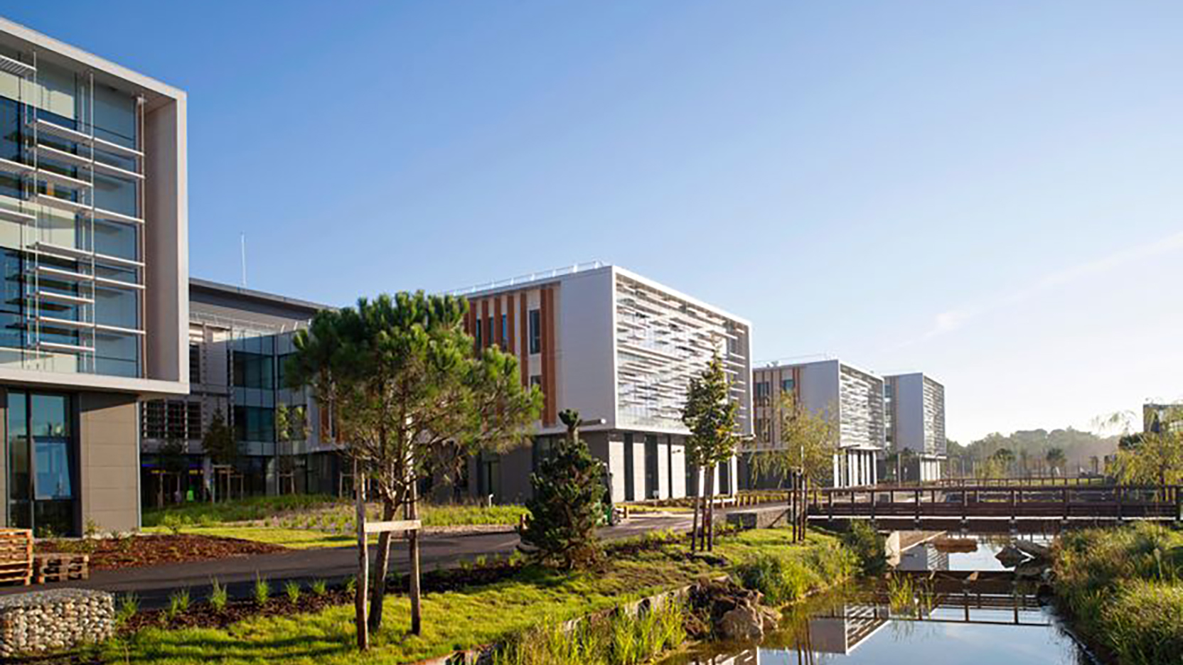
The descriptor Smart Building backed onto the logo describes the brand in two ways: first, by enhancing the group’s atypical building method and its constant policy of improvement through investment in R&D, and secondly by emphasizing the smart dimension of the buildings already completed, which incorporate features such as monitoring and management of energy consumption with Galaxy Pilot.
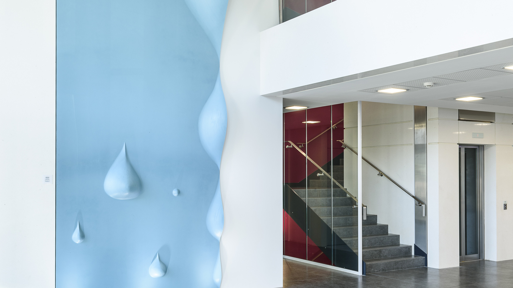
The new identity graces the newly launched web site ga.fr, positioned at the heart of the social networks. GA’s Paris offices have also been revamped to match the new impetus, its start-up spirit and its resolutely innovative image.

The renewed brand image conveys our conviction that a building is a powerful social space where facilitating the lives of its occupiers is of paramount importance. This revival follows on from the philosophy of the 140-year-old start-up that we are, and opens up a new era in the group's history.